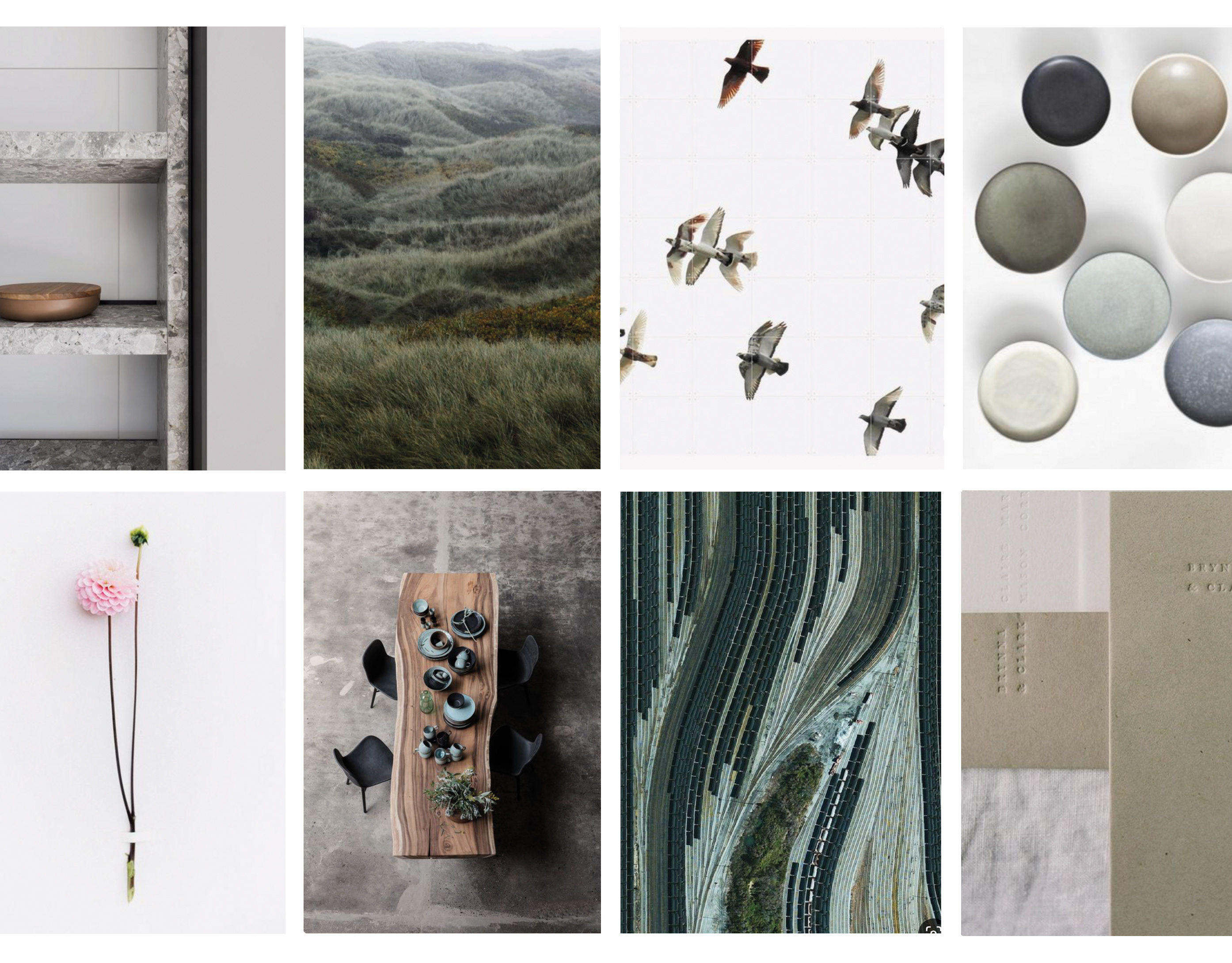
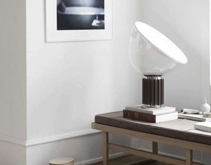
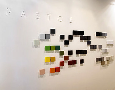
Interior concept, concept design en creative direction for AkzoNobel's workspaces and offices. Color is at the heart of world’s largest paint and coatings company AkzoNobel, and the interior should be the brand ambassador! In this concept color is key, being more than just decoration it directs, invites, adds dynamic, provides identity and finally becomes an experience. The color flows of AkzoNobel's identity are applied to define parts of the interior. What started as a surprising unique color transformation of the (old) headoffice in Arnhem, resulted in a new office style and guidelines for AkzoNobel offices worldwide. By keeping the color flows and materials the same and color application optional, different work environments can be transformed, depending on activities and budget, while keeping a consistent image.
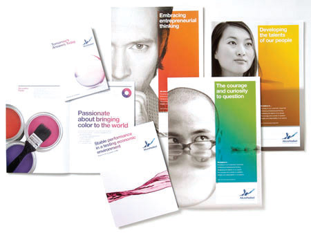
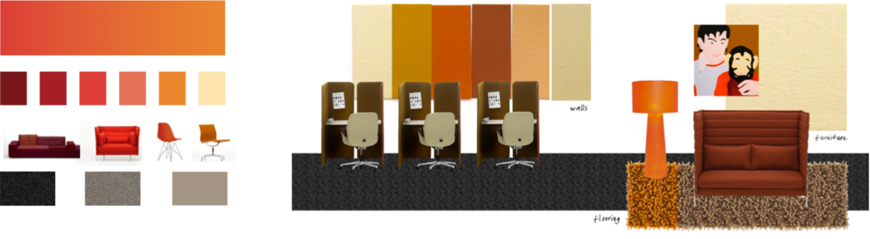
CONCEPT // AN huisstijl in 2D-toepassing, visualisatie concept
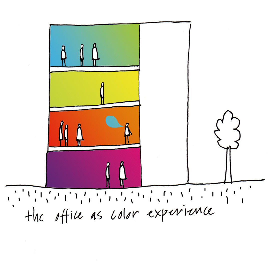
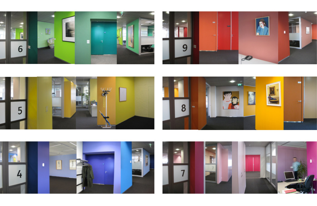
AKZONOBEL (OUD)HOOFDKANTOOR ARNHEM // per verdieping is een kleurflow van de huisstijl gevisualiseerd
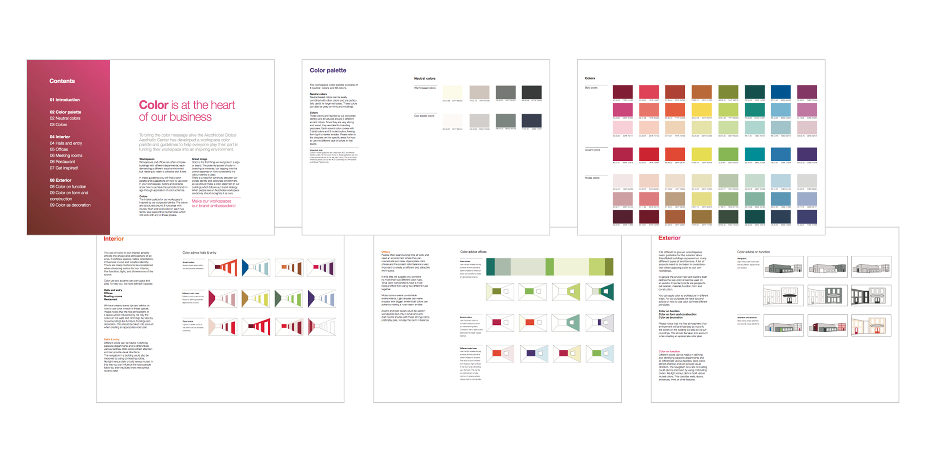
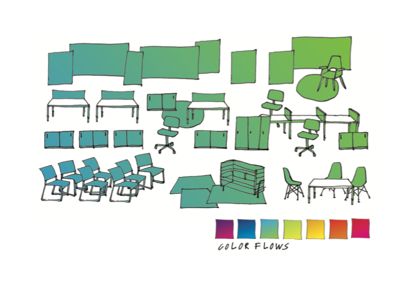
HUISSTIJLBOEK INTERIEUR // uitleg, richtlijnen en inspiratie voor toepassing van de huisstijl in interieur en exterieur